
This is not a review, but if it were to be one, I’d say Schweppes understands how timing matters in this case, just as much as it understands bubbles. Rolling out a visual identity refresh in the festive season is not accidental, it’s strategic. December is when brands fight for table presence, fridge real estate and Instagram frames.
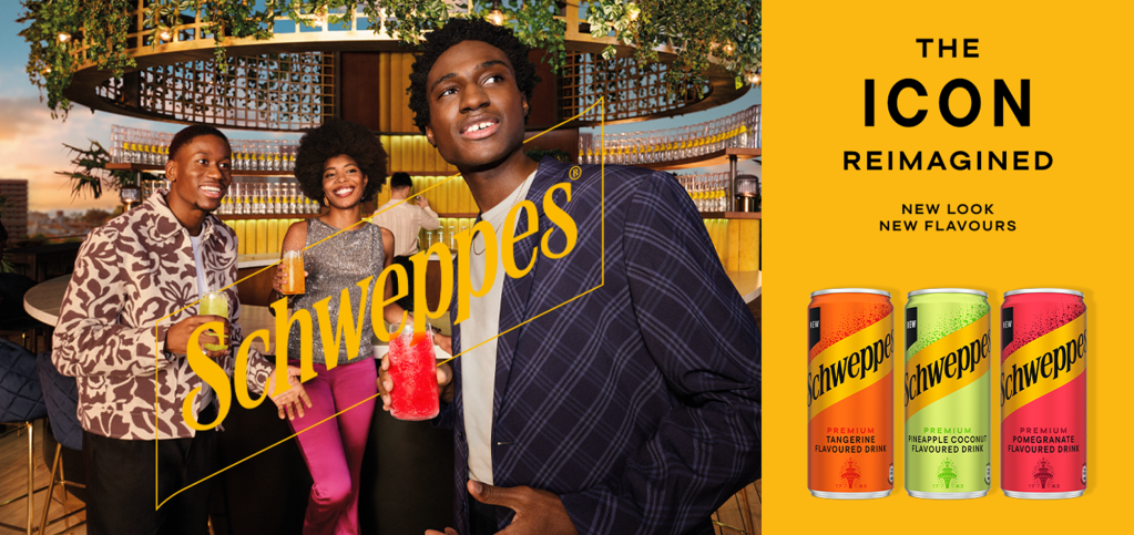
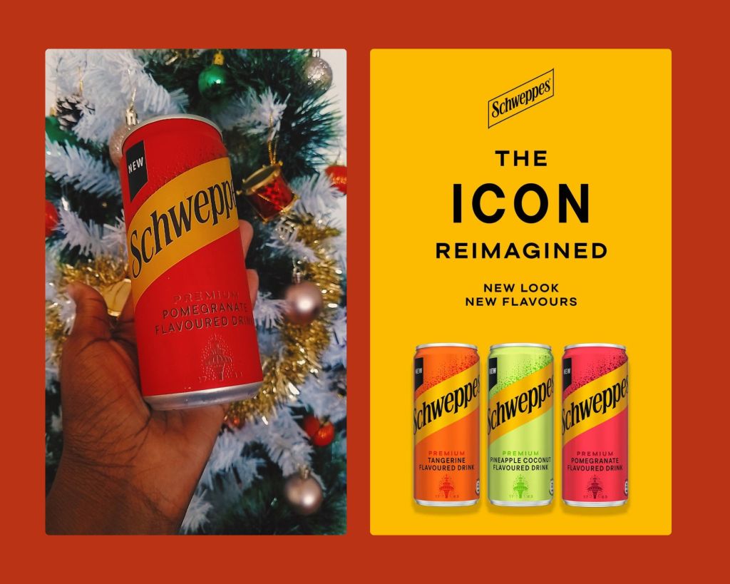
Schweppes’ refreshed cans and the return of the iconic Skittle bottle feel deliberately designed for that moment when drinks stop being background noise and start becoming part of the aesthetic.
The metallic finishes, the confident saffron ribbon, the unmistakable wordmark, I wouldn’t clasify this as a reinvention, it’s a recalibration. A reminder that heritage brands don’t need to shout, but they do need to shimmer every now and again.
A twinkle of heritage, but make it social-agenda aware.
Schweppes has always positioned itself as grown. Not loud. Never trend-chasing. Just assured. What’s interesting about this refresh is how quietly it aligns with a broader shift in how people socialise. The rise of non-alcoholic and straight-drinking beverages isn’t about abstinence, though in some cases it is, this time around it’s about autonomy. Consumers, especially Millennials and Gen-Z, want drinks that still feel intentional, celebratory and premium without needing a mixer or an excuse. Schweppes sliding into this space feels less like a pivot and more like a natural extension of what the brand has always been signalling.
According to IWSR insights, taste, brand trust and availability now sit alongside moderation as decision drivers. Schweppes ticks all three, but the packaging makes sure you see that before you even taste it. And I’ll get into the taste conversation with an article after SA20 Opening Game in Newlands on the 26th of December…

The Skittle bottle return is doing cultural work
The reintroduction of the curved Skittle bottle is one of the smartest moves in this rollout. Originally designed to preserve carbonation, it now does something else just as important: it signals occasion.
In its refined 1L PET format, the bottle feels equally at home on a festive table, at a brunch spread, or in a boardroom fridge. It’s heritage made practical, which is exactly what modern premium consumers respond to.
Flavours that don’t try too hard
The trio of : Pineapple Coconut, Pomegranate and Tangerine, feels intentionally restrained. No gimmicks. No novelty-for-novelty’s-sake.
- Pineapple Coconut leans escapist and relaxed.
- Tangerine is crisp, familiar but elevated.
- Pomegranate gives bold, slightly tart, grown, and indulgent.
I did say this is not a review, but I tasted them, and Pomegranate is the one. It carries the weight. It feels like the flavour you choose when you want something that feels bold, composed, and intentional.
Where I’d like to see Schweppes show up next
Here’s where the marketing opportunity opens wider. Schweppes feels perfectly positioned for entrepreneurial and leadership spaces, particularly those centered around women and men in business, founders, creatives, and startup culture. Not nightclubs. Not mass concerts. But curated, thoughtful gatherings. Think:
- Women-led brunches
- High-tea style networking events
- Founder breakfasts
- Creative economy panels
- Business startup launcheons
- Gala Dinner gatherings
A Schweppes’ partnership at a women’s brunch or high-tea wouldn’t just be refreshing, it would be culturally fluent. A Schweppes’ partnership at a mens fundraiser cigar evening wouldn’t just be about a drink or two, it would be a refreshing summery at the end of a conversation. These types of partnerships represent brand visibility as well as saying: we see you, we support how you gather, and we belong in these rooms. The brand already carries the visual language of sophistication. Now it’s about embedding that language into the spaces where modern social capital is being built.
This festive refresh isn’t loud, and that’s its strength. Schweppes isn’t trying to convince you it’s premium, it’s reminding you that it always was.
This Schweppes’ image upgrade feels less like a makeover and more like a quiet return to the centre of the table, exactly where it wants to be.


